INTRODUCTION
Geography matters in everything that we do. It affects our neighborhoods, our health, and the health of our environment. Using spatial data or data with a geographic component, we create maps where the data itself has a location. It also has information about the location’s landscape. In the Russian school of geography, the science that dealt with biophysical features of the environment was called landscape science, which was an early influence on medical geography.1 Jacques May, the father of American medical geography, was a French-born doctor whose experiences in Indo-china at the beginning of the 20th century informed much of his geographic understanding of the disease. To May, a disease is a “multifactorial phenomenon which occurs only if factors coincide in space and time”.2 To him, medical geographies encompass geographical environments and cultural landscapes because of cultural choices such as house type, diet, and clothing could buffer or expose populations to disease.
The foundational idea of disease ecology viewing human life as a process of continual interaction between internal and external environments3 can be seen as early as the 5th century in the writings of Hippocrates. Maps of disease rates in different countries emerged in 1694 to characterize the spread and possible causes of outbreaks of infectious diseases such as plague and cholera.4 The use of geographic information in epidemiology was initiated by the British anesthesiologist Dr. John Snow, who linked a street water pump to cholera in Soho, London, in 1854. John Snow is widely considered the father of spatial epidemiology.5
Spatial epidemiology is the science that describes and analyzes geographically indexed health data concerning demographic, environmental, behavioral, socio-economic, genetic, and infectious risk factors.6 Over the ensuing decades, spatial epidemiology grew in complexity and utility. Spatial approaches have involved increasingly sophisticated mapping, modeling, and analysis techniques. However, its scope and applications were dramatically transformed in the 1990s by introducing new geographic information systems (GIS) computing technology.7
GIS is the tool we use to capture, store, process, analyze, and visualize spatial information. With the modernization of mapping applications, GIS expanded to health and human services. Epidemiologists, biostatisticians, and environmental health professionals were early adopters of GIS. It also gained acceptance in American healthcare as an essential marketplace tool for strategic planning and marketing beginning in the early 1990s. However, as the healthcare system came under greater pressure to slow cost increases, workforce reductions in non-essential departments, computer mapping, and demographic analysis were outsourced to large consulting firms. The deployment was almost exclusively desktop, and seldom was GIS part of an enterprise approach to information technology (IT).8
However, a movement to web and cloud computing, integration of real-time information, the internet of things (IoT), mobile computing apps, machine learning, and automated workflows increased pressure on private and public healthcare enterprises to adopt and use digital technology to scale up to complex healthcare. There are many emerging drivers for GIS growth in health and human services. For example, during the coronavirus disease-2019 (COVID-19) pandemic, GIS dashboards were used to understand intensive care unit (ICU) bed and resource capacity, testing and vaccine sites, school, business, and event reopening. Additionally, such dashboards became essential tools to engage and inform the public with daily counts of cases and deaths.9
A drive toward continuous quality improvement (QI) and accountability in the U. S. Healthcare System necessitates hospital executives to use advanced analytic and visualization tools, such as those within the ArcGIS dashboard, to study services delivered nationally by tracking key performance indicators (KPI). However, despite GIS’s methodological expertise in evaluating the dynamics of changing health patterns across a diverse patient population, its application in assessing international patient healthcare has not been thoroughly investigated.
While Global Healthcare Accreditation (GHA) for medical tourism validates international patient healthcare best practices parameters, the standards on KPIs for medical travelers seeking care at American hospitals still depend on an individual business model. It is paramount to apply the same interest and commitment to healthcare quality indicators to a medical travel service program as it is to understand the bottom-line contribution of a medical travel service program.10
The aeronautical reconnaissance coverage geographic information system (ArcGIS) dashboard is a data management processing system representing spatial data as map layers. It supports a set of visualization functions enabling rich-featured overlay maps and makes it possible to query a data set according to attribute location or combination. The ArcGIS dashboard has the unique capacity to integrate and analyze diverse data, identify community resources, and connect community stakeholders to support vulnerable populations. What underpins these is the variety of data models and operations associated with the models’ GIS provides and supports. By linking spatial, numeric and categorical health data through a single interface, the ArcGIS dashboard adds the dimension of location and the quality of health information needed at the point of care. Its functions may be used to answer questions that would be difficult to answer without integrating raw patient data with location intelligence technology. However, the provision of GIS functionalities at the point of care has not been thoroughly investigated.
Since GIS implements many concepts of GIScience and spatial epidemiology, its use by public health authorities and hospitals has been inextricably related. A variety of GIS applications supported both systems; however, the potential for their complete synergy has not yet been realized. Although, the public health system is the hospital’s biggest consumer of its data, public health contributions are not integrated back with electronic health records. The absence of a reliable system integrator is considered one of the main obstacles to healthcare challenges. Without informing clinical providers and decision makers on the ground in real time, the point of care becomes a point of failure. Despite growing interest in GIS-dashboards applications, their adoption rate in healthcare is still low.
Case Study
One geographical study in this context was carried out by an American hospital in collaboration with a local university as a part of a project intended to investigate the feasibility of integrating hospital health data and GIS. Results of this study have been reported on May 3, 2021, during the Health Informatics and Analytics Department Capstone Presentation titled “Addressing Disruption in Global Healthcare Delivery in the Hospital Setting Due to the COVID-19 Pandemic Using ArcGIS Dashboard”, however, they are not included at this paper.
The following section summarizes experience from this project and offers an opportunity to examine how well the ArcGIS dashboard leverages the understanding of the interruption in care for international patients based on their home location and supports the hospital’s reaching a revenue recovery milestone. Additionally, it examines the feasibility of designing an ArcGIS dashboard in the GIS-naïve environment to fit the spatial epidemiology study.
BACKGROUND, DATA SETS AND METHODS
The World Health Organization (WHO) declared severe acute respiratory syndrome coronavirus 2 (SARS-CoV-2) or COVID-19 a pandemic on March 11, 2020. To decrease the spread of COVID-19, travel bans and border lockdowns were implemented worldwide. As a result, since March 2020, international travel for medical treatment came to a halt, which strained the clinical and operational healthcare systems that provide medical care for international patients seeking medical attention.11,12 Being impacted on both the patient and healthcare sides, the cross-border healthcare industry faced multiple recovery challenges.
The setting for this study is a tertiary hospital in the United States of America (USA), dedicated to caring for patients with complex conditions from various geographies. The number of international patient discharges and outpatient visits has been lower than pre-outbreak levels. The interruptions in global patient care bring an imbalance within a hospital’s payor mix and signal the hospital’s leaders to mobilize targeted interventions to safeguard the hospital’s economic health.
In response to this, health authorities have called for a geographical study to evaluate the ArcGIS-enabled information dashboard (Environmental Systems Research Institute (ESRI), Redlands, CA, USA) as a business analytic tool to visualize how the volume of international patients has shifted based on their home location.
For this purpose, health authorities want to evaluate a year-over-year (2019-2020) change in the annual volume of total patient visits per country to understand the health services utilization trends by patients from each country.
They may potentially be interested in knowing any clusters where the population is likely to have continued risks of accessing care. Areas in each group may be dealt with together in later resource delivery, perhaps associated with an additional screening program. In future health, authorities may also like to know any possible relationships between patients’ service utilization and some socio-economic and/or environmental factors.
The hospital Institutional Review Board (IRB) approved this study as a retrospective study of aggregated patient data at the country level and categorized it as non-human subject research (NHSR). The Health Insurance Portability and Accountability Act (HIPAA) privacy rule requires that all reasonable efforts be made to use only the minimum necessary identifiable healthcare information to achieve the intended purpose. Therefore, the study data set was limited to only those records that included information about services utilized by the patients from each country over the years 2019-2020.
The geographic area of the study encompasses 122 countries across six continents. According to the International Organization for Standardization (ISO 3166), countries’ names were corrected. Study variables included country of origin (categorical, nominal data), the year of the patient visit (quantitative, numerical, continuous type), number of total hospital visits (quantitative, numerical, discrete type), number of hospitalizations (quantitative, numerical, discrete type), number of ambulatory visits (quantitative, numerical, discrete type), number of patients with more than one episode of care within each year (quantitative, numerical, discrete type). The ‘Count Difference’ in ‘Total Visits’ was selected as the primary variable. The new field ‘Difference in Visit Counts by Country’ was created by subtracting total visits from the 2019 dataset from total visits corresponding to the 2020 dataset. In addition, a new field, ‘Countries Groups’, was created by applying an ordinal ranking to each country to identify four cohorts according to their ranking position on the distribution trajectory in ascending fashion.
The ArcGIS dashboard processing functions were applied to prepare geocoded international population data by accessing spatial feature attributes in the research patient data repository (RPDR) and using the feature-to-feature join function based on the ISO A3 country code system. The modeling and linking operations were implemented through dashboard programming languages, such as Structured Query Language (SQL) and Python, and configuring study parameters to fit the spatial epidemiology model. The process resulted in three data-driven dashboard elements: area map, attribute table, and statistical plots. A map view is displayed in Figure 1.
Figure 1. The Data-driven Map Shows How the International Patient Population was Affected by Measuring the Year-over-year Changes in Total Visit Counts for Patients Who Traveled from their Homes to America to Receive Medical Treatment from 2019 to 2020. The Annual Aggregate Hospital Visits Dropped by more than Half from 2019 to 2020
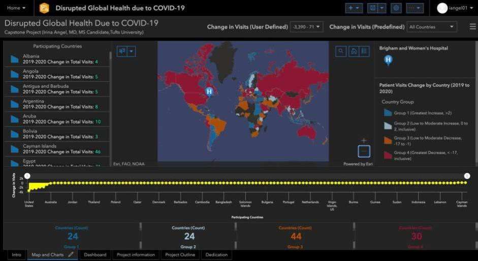
Using the color, the user can estimate the amount and the direction of changes in the total visit counts and classify the geographic area of the study population into four groups, where the same color labels each group based on similar values. Four-colorcoded cohorts of countries are based on the ordinal ranking of the ‘count difference in total visits’. Two blues depict positives, and their counterparts show negatives. The deeper blue represents the highest output, and red versus orange represents the lowest output across the continuous ranking distribution.
The system allows the user to perform some operations on each view, such as changing object properties like patterns in a map or plot view. Most importantly, the system maintains ‘hot’ links among views so that a selection of view objects in a view can be reflected in another view by automatically updating whenever the values used to construct it are changed. The dynamic feature is essential to exploring different properties of spatial data simultaneously.
Figure 2 represents the interactive mode, depicting the user-defined method to visualize a change in ‘Total Visits’ for international patients independent of the country in the selected-by-user range (-2.000 to -800). The map is configured to interact with other elements, including serial chart, list, and indicators. The serial chart (the yellow horizontal graph) updates as the map pans or zooms. The chart consists of the vertical (y) axis, which corresponds to the difference in total visits, and a horizontal (x) axis, representing a country’s position in ascending order according to its nominal ranking value weight. The list (the rows of text on the left-hand side ) uses the map’s operational layer to show participating countries by type. Finally, the indicator in the bottom row of the dashboard displays the count 3, representing countries from Group 4 with the most significant change in ‘Total Visits’ from 2019 to 2020.
Figure 2. The Dashboard Provides Details About Study Locations, Where the Year-Over-Year Change in Total Visits Count Fell within the Selected-By User Range (-2000 to -800)
RESULTS
Given the considerations such as the complexity of the Healthcare System and the necessary safeguards and constraints of public information sharing, statistical analysis was not the objective of this presentation. Additionally, the study results were only used for the health services delivery domain. Therefore, methods were employed to find patterns of the spatial variations of health utilization rates and not the evidence of the association between the change in utilization and factors related to COVID-19.
It should be noted that given the purpose of this paper, the design description was greatly simplified. In addition, original data was transformed into a spatial format using spatial analysis methods and techniques. The discussion of them is beyond the scope of this presentation and is not pursued in this paper. Finally, the case study was not intended to be inclusive but rather to evaluate ArcGIS Dashboard capabilities to visualize the interruption in care for international patient populations.
GIS dashboard was selected as a technical solution to solve this case because it supported the project’s functional requirements as data integration, management, and visualization. The hospital’s first ever ArcGIS dashboard fully met the case study objectives and achieved acceptance by the hospital. It enhanced the understanding of variability in total hospital visits for patients who come to the hospital from outside the United States. It made it easy to differentiate the variability in trends across participating countries and provided a nuanced insight that international travel to the hospital did not come to a complete halt despite travel bans and border lockdowns implemented worldwide to decrease the spread of COVID-19.
Central to this international patient treatment access study was the idea that sharp changes in health services utilization occurring in COVID-19 might suggest a growing treatment access gap. It would benefit from detection analysis to understand the types of barriers and developments in the methodologies focused on preventing the future incidence of disruption in healthcare access and aligning areas with meaningful resources. The dashboard provides intelligent support for deriving insights and underpins its potential as a swift tool for exploring spatial variations across the international care sector, analyzing patient population locations, identifying new markets, and realigning their service mix.
DISCUSSION
The increasing use and availability of computerization in medical care made large new healthcare databases available for analysis. Cell phone records, Global Positioning System trackers, updates from Twitter, and Four Square check-ins are examples of spatial data collections with the potential to be integrated with electronic health records to advance spatial epidemiology and patient care, among other benefits. As a result, geospatial information is becoming commonplace in healthcare and applicable to GIS processing. Although the value of GIS in the marketplace has been recognized and used by hospitals in the United States since the early 1990s, health data mapping and analysis are still outsourced to large consulting firms. Thus, despite early interest in GIS applications, this powerful tool has not yet become commonplace in healthcare in the United States.
However, the growth of GIS has been driven by the recognition of its value in solving real-world problems. For example, during the COVID-19 pandemic, GIS dashboards were used to understand ICU bed and resource capacity, testing and vaccine sites, school, business, and event reopening. Additionally, such dashboards became essential tools to engage and inform the public with daily counts of cases and deaths.9
Since patient access to healthcare is controlled by geographic location, patient records routinely include street addresses, postal codes, or other location elements. By extracting data from a hospital’s electronic health record, location-based analysis of patients of interest may show patterns such as changes in health services utilization and inadequate treatment access. Defining geographic areas for intervention opportunities could improve health outcomes and health system costs. While there is a significant value in seeing this data in a dynamic table, it is critical to give it spatial context in location intelligence software, like ArcGIS, transforming raw spatial data into meaningful and actionable intelligence.13
There are limited studies illustrating the process of handling and integrating raw data with location intelligence technology in the hospital setting. Additionally, case studies concerning functional and non-functional requirements of building an ArcGIS dashboard in the hospital environment are not readily available.
This paper evaluates the ArcGIS dashboard through a case study of disruption in care for international patient populations due to the COVID-19 pandemic based on their home locations at the tertiary hospital in the U. S.
ArcGIS dashboard functions were useful in constructing a framework to visualize patterns. Both ArcGIS data processing and data visualization tools were shown to be capable of identifying spatial variations on a global scale. Since the data used in this case study comes from the hospital health data repository, constructing the dashboard afforded an opportunity to explore the provision of GIS functionalities in the hospital environment.
Despite dashboard acceptance by the client hospital, it is recognized that the scalability of the proposed model in the hospital environment is limited. The model uses the loose-coupling approach where two components (electronic health records and GIS) exchange data in the form of files and therefore require user intervention. To use the close-coupling method, a GIS must provide application programming interface (API) for other components to access its data directly or through an internal transferring service. As a result, this approach is not user-friendly in the hospital environment. Therefore, an alternative method is recommended.
According to the health standards-driven research, the promising approach would involve the implementation of fast healthcare interoperability resources (FHIR). FHIR is the structured language—more accurately, a specification—developed by an open source community called health level seven (HL7).14 It allows each facility to maintain its internal language while speaking a well-defined, standards-based language to third-party servers. It supports the third party to consume the information and gain a new understanding that spans multiple health networks without requiring additional reporting at busy provider locations.
Using FHIR as a resource to overcome data and systems scaling limitations for dashboards and other GIS technology to become commonplace in healthcare will redefine our environment in the ways yet to be discovered.
CONCLUSION
Since GIS implements many of the concepts of GIScience and spatial epidemiology, it is suitable to meet the needs of researchers from various disciplines-epidemiology, geography, health planning, health service management, and business operations and let researchers from other disciplines effectively evaluate various epidemiologic inquiries and what-if-scenarios that arise in decision-making healthcare challenges.
Sharing models with colleagues helps standardize decision-making processes and establish uniform practices in the hospital. In addition, learning how to use GIS-enabled modeling efficiently will facilitate and automate many hospital projects and workflows, spanning from economic to patient-care outcomes.
Following the discussion in the previous session, this paper underpins the benefits of the provision of GIS functionalities in the electronic medical records to improve health outcomes, lower costs, and advance spatial epidemiology research.
Additionally, it showcased that the GIS dashboard’s strength does not only lie with its unparallel functionalities of reconciling aspatial data, but it is also uniquely aligned with the human brain. For example, using data-driven maps, graphs, and lists on the dashboard made it easier to see subtle patterns in trends across participating countries that did not stand out in the default tabular formatted report option. Thus, visualizing high–resolution data in an aesthetic form is state of the art in conveying ideas effectively.
Finally, the ArcGIS dashboard is uniquely positioned to advance spatial epidemiology research in the areas of the domestic and international health services, and, arguably, in the decades ahead, the geographic information system will prove its value in aiding clinical practice and business operations. It is pointed out that the material presented in this paper is not intended to be an exhaustive examination of GIS but rather a brief introduction and overview, which hopefully will generate further interest and self-discovery.